Multiple providers
Cashback, offers and gift cards were powered by different providers with different rules, timings and mechanics.
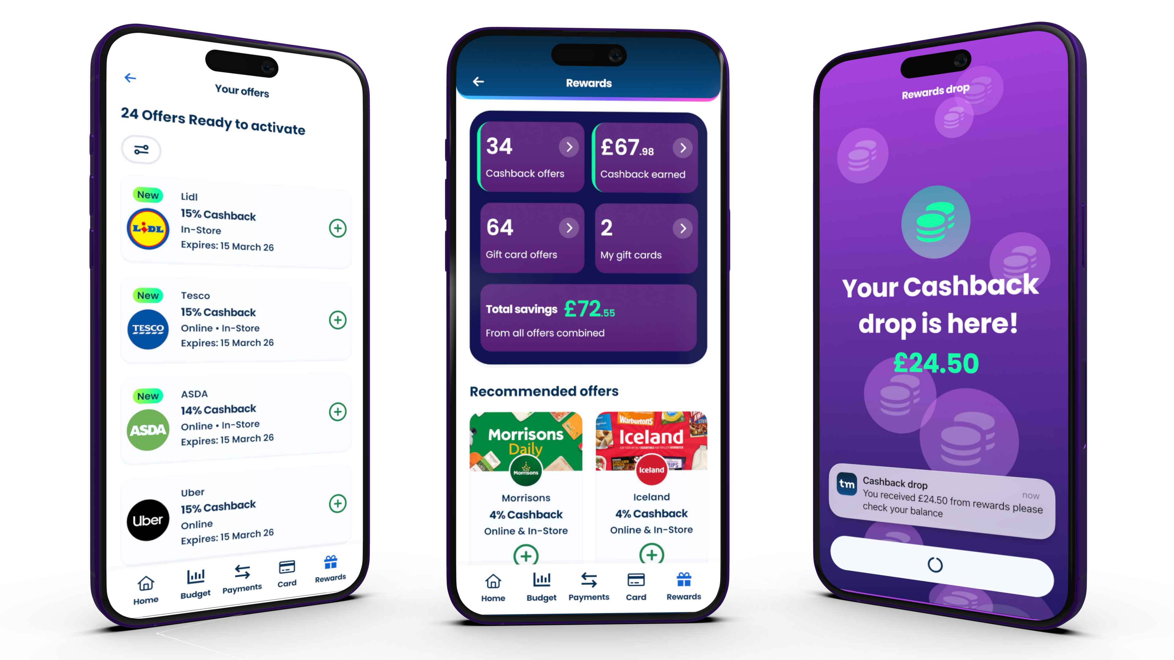
Case study
Bringing cashback, offers and gift cards into one simple experience that made the value of thinkmoney's paid accounts easier to see and use.
Head of Design
Proposition, IA and UX
Product strategy, journeys, testing and UI direction
August 2026
thinkmoney customers had access to several ways to save money, including cashback, offers and gift cards. But these benefits existed across separate experiences, making the overall value of the proposition harder to understand.
Rewards brought those benefits together into one destination, giving customers a clearer way to discover, understand and use the savings available through their account.
I led the design direction across the proposition, information architecture and customer experience, working with product, engineering, commercial and content to shape how Rewards worked and how its value was communicated.
The existing experience expected customers to understand different reward types, providers and mechanics before the benefit became clear.
The challenge was to reverse that relationship: lead with the value to the customer, while keeping the complexity required to deliver it behind the experience.
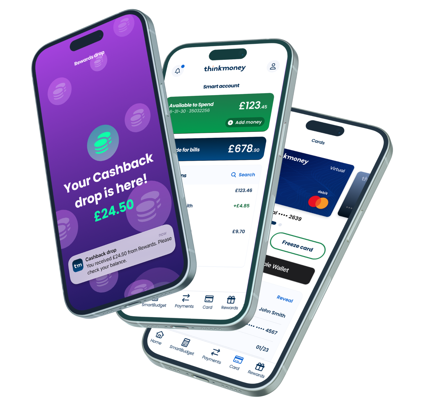
Cashback, offers and gift cards were powered by different providers with different rules, timings and mechanics.
Existing customers already understood parts of the proposition, so the new experience needed to improve clarity without making everything feel unfamiliar.
The product needed to accommodate changing partners, offers and future reward types without creating another fragmented experience.
Eligibility, timing and provider terms still needed to be clear and accessible without overwhelming the primary journey.
Rather than presenting cashback, offers and gift cards as separate products, Rewards became the parent experience for discovering and managing ways to save.
Customers could browse opportunities, activate offers, buy gift cards and track their rewards without first having to understand which provider or mechanic sat behind them.
See relevant ways to save in one place.
Quickly understand the value, action and conditions.
Activate an offer, buy a gift card or use a reward.
See what is active, pending, earned or used.
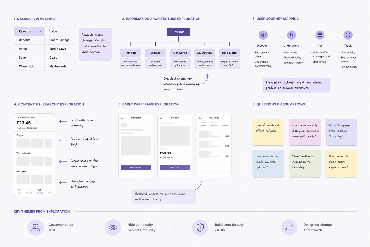
Before designing individual screens, I explored how customers should understand the relationship between different ways to save.
That meant working through naming, grouping, browsing, activation, gift card purchase, pending rewards and history as parts of one connected experience rather than isolated features.
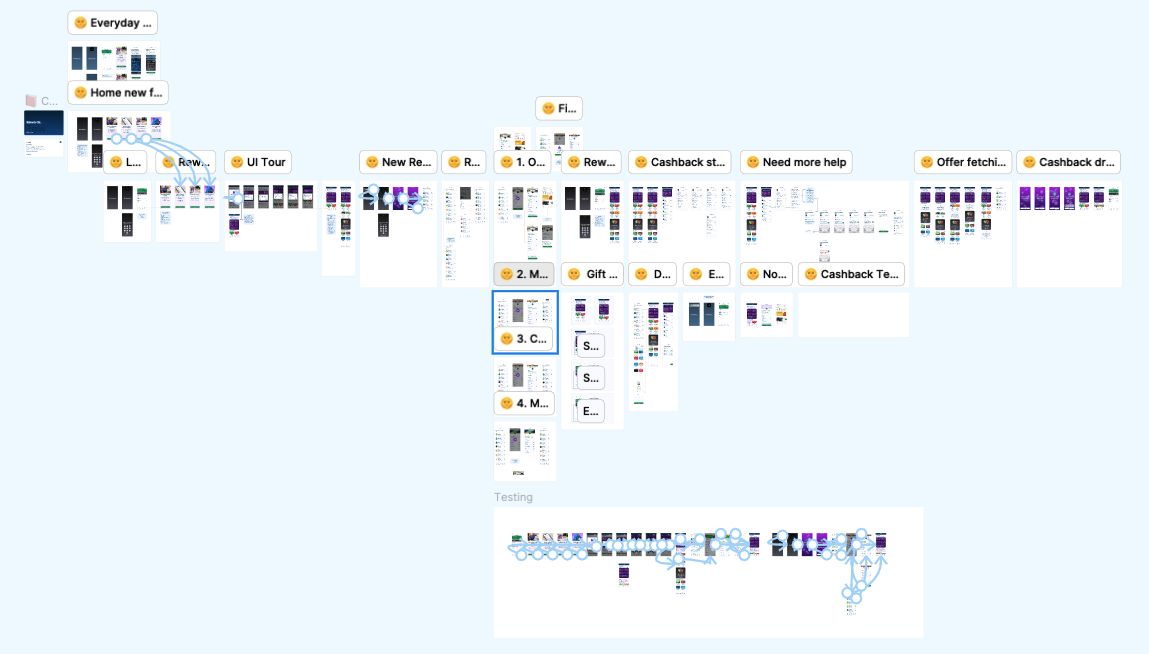
I used moderated qualitative testing with six participants, five prospective customers and one existing thinkmoney customer, to test whether the Rewards proposition made sense before refining the experience.
Personalised cashback was seen as relevant and easy to understand, while placing Rewards inside the banking app helped build trust. Testing also exposed areas that needed work, particularly the distinction between cashback and gift cards, savings terminology and expectations around offer refresh and expiry.
Make it obvious that once an offer is activated, customers simply pay with their thinkmoney card and cashback tracks automatically.
Strengthen the visual and written distinction between cashback offers and discounted gift cards.
Use clearer terminology around cashback earned, gift card savings and total reward value.
Give customers clearer expectations around new offers, expiry, refresh and ongoing availability.
Different mechanics had to be translated into language that made sense as part of one customer proposition.
Shared patterns reduced the individuality of each provider experience, but made Rewards easier to understand as a whole.
Saving and action came first, with conditions available close by rather than becoming the opening message.
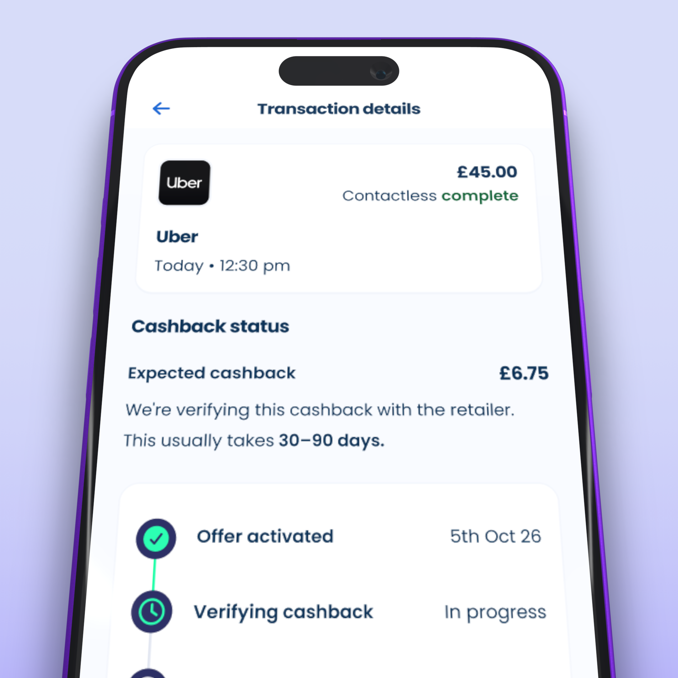
The interface prioritised what customers needed to understand first: what the reward was worth, what they needed to do and whether it was relevant to them.
Timing, eligibility, provider information and terms remained accessible, but were deliberately secondary to the value and action.
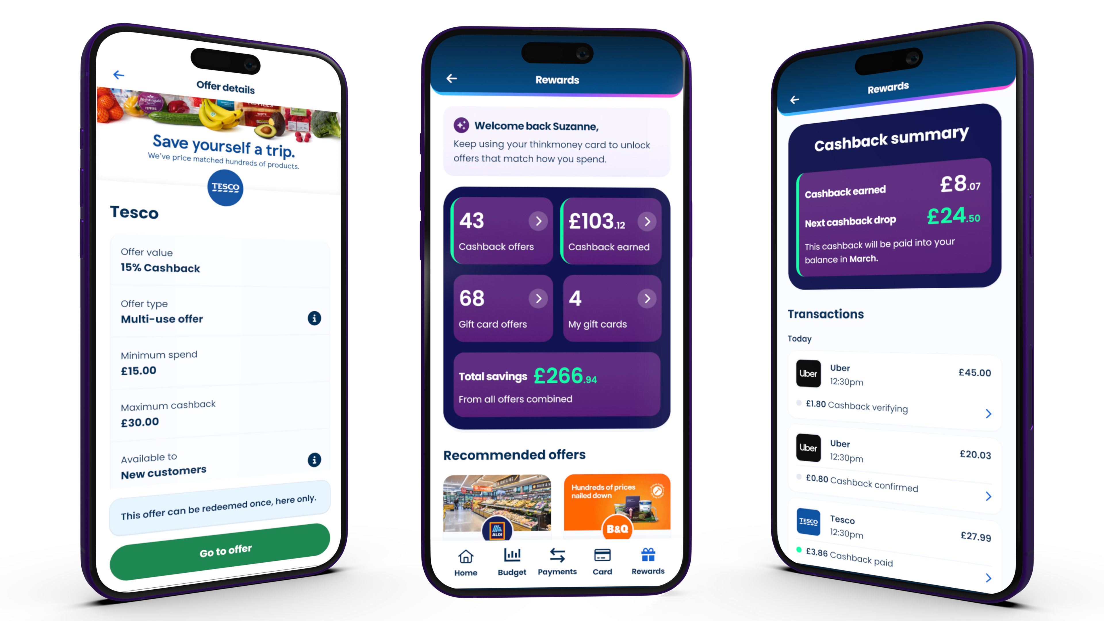
13,696 of 51,158 monthly active customers engaged with Rewards within the first three weeks of launch.
18% of customers who engaged went on to activate an offer, showing progression from browsing into intent.
390 customers generated 850 qualifying transactions, averaging just over two transactions per transacting customer.
The most important decisions happened before the final interface: defining a clearer customer mental model, bringing disconnected benefits together and choosing language that made the value easier to understand.
Early behaviour after launch supported that direction. Nearly half of traffic in the latest week was from returning customers, while personalised offers were seeing activation rates of 20–35% compared with 2–14% for always-on offers. Customers were also returning to transact, averaging just over two qualifying transactions each.
It also gave the team a clearer next problem to solve. Around 2,000 customers had activated an offer but had not yet spent, creating an opportunity to improve post-activation communication and help more customers complete the journey.