Customer
Make it immediately clear whether SubMe is available and what the customer can currently access.
Case study
Design a simple short-term credit experience that helps eligible customers understand what they can borrow, what they need to do and what happens next.
Head of Design
Proposition, eligibility and UX
thinkmoney SubMe
Product thinking, journey design, customer states and interface direction
SubMe gives eligible thinkmoney customers access to small amounts of short-term credit directly through their existing banking experience.
The product needed to make borrowing straightforward while still clearly communicating eligibility, available limits and what customers could expect before deciding to continue.
I led the design direction across the proposition, customer journey and interface, working with product, engineering and commercial teams to translate the underlying credit rules into a simpler customer experience.
Customers needed to understand quickly whether SubMe was available to them, how much they could access and what they needed to do next.
The challenge was to remove unnecessary friction while keeping the information required to make an informed borrowing decision clear and visible.
Make it immediately clear whether SubMe is available and what the customer can currently access.
Turn eligibility rules and changing limits into one coherent, repeatable customer journey.
Create a controlled credit proposition that can evolve without continually redesigning the customer experience.
Eligibility was informed by account behaviour, including at least £500 coming into the account and at least two Direct Debits or Standing Orders.
Customers did not need to understand every rule behind that decision. They needed a clear answer about their current status and what, if anything, they could do next.
The interface focused on customer-facing states rather than exposing the complexity of the underlying decision model.
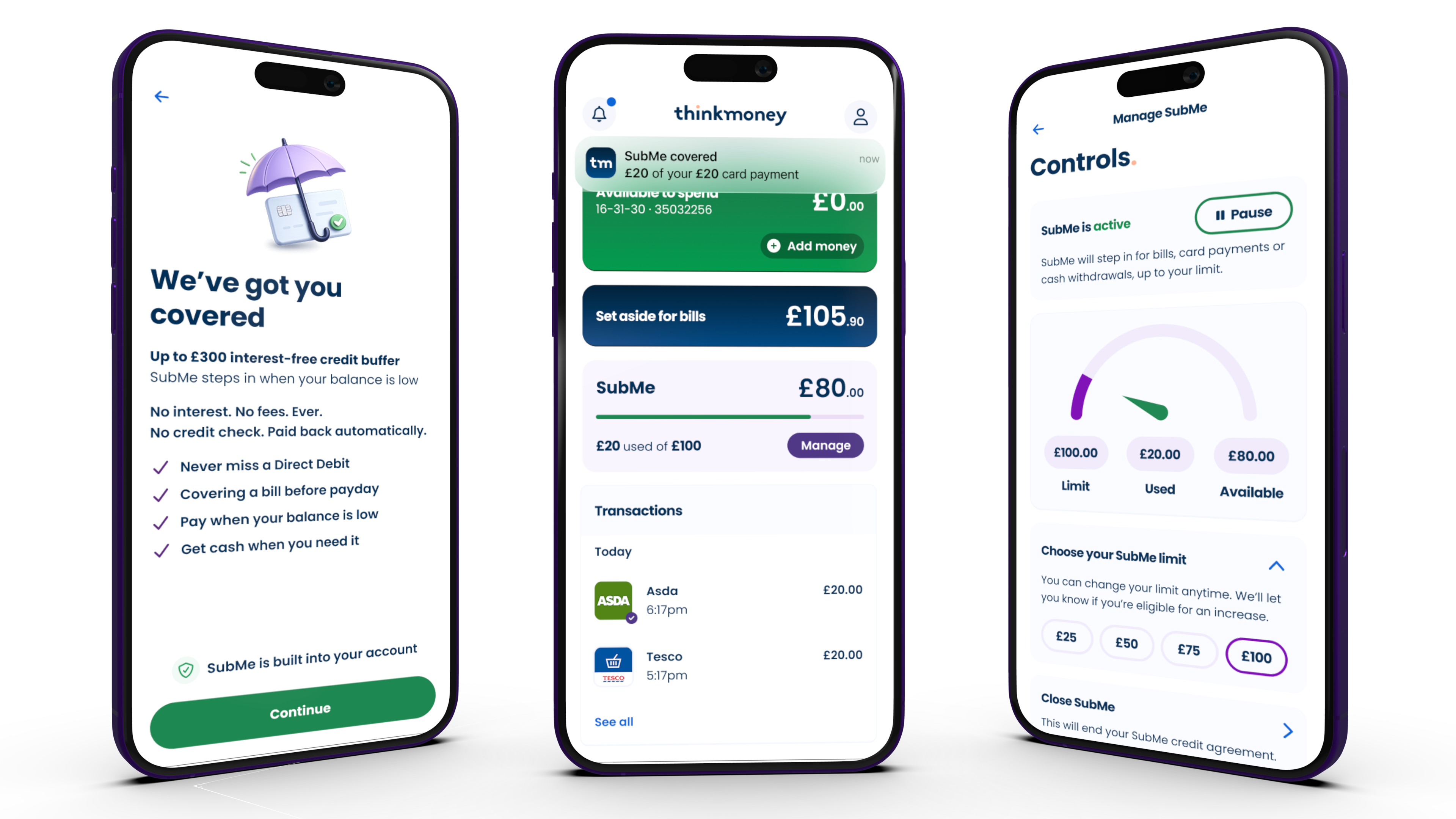
Customers should quickly understand whether SubMe is available and the amount they can currently access.
Important borrowing and repayment information should appear before the customer commits.
Credit rules should shape the experience without requiring customers to interpret those rules themselves.
The interface needed to support changing available limits without creating a new journey each time.
Understand whether SubMe can currently be accessed.
See the amount currently available to borrow.
Understand the important borrowing and repayment information.
Continue, manage the product or understand the current state.
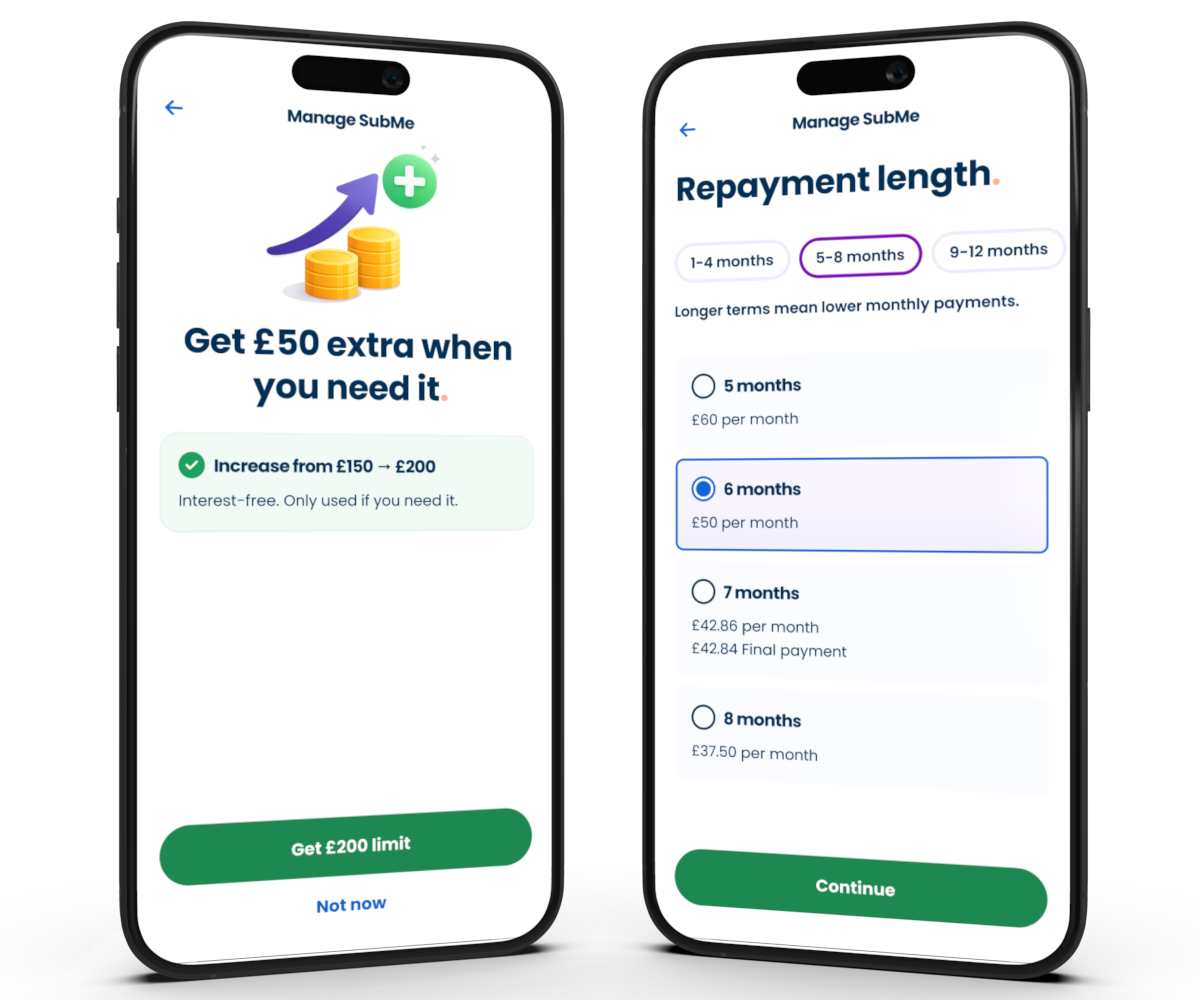
SubMe uses stepped limits beginning at £25 and progressing up to £300.
Rather than designing a different experience around every amount, I treated the limit as a changing product state within one consistent journey.
This keeps the experience familiar as the amount available to a customer changes over time.
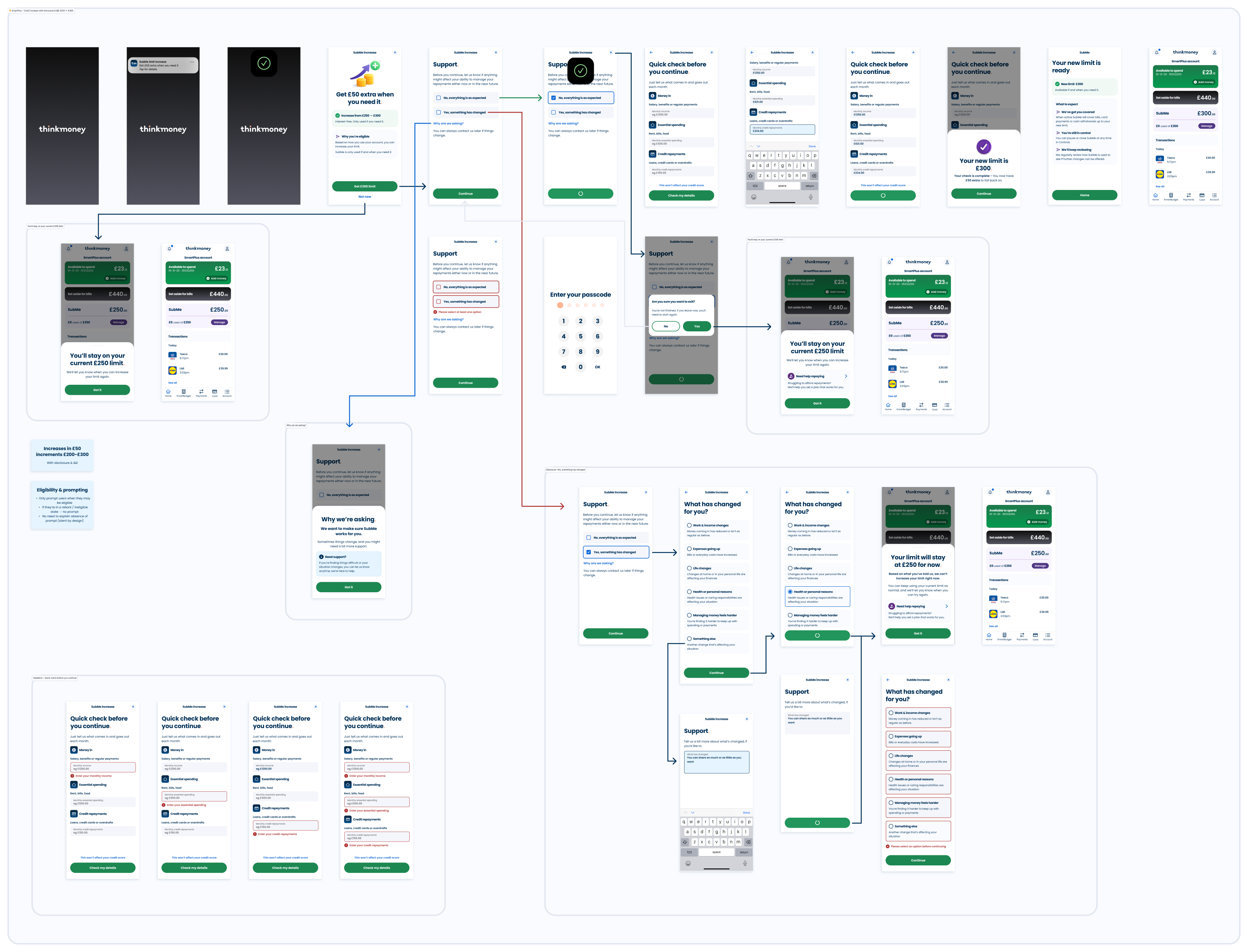
Early exploration focused on how much information customers needed at each point and how eligibility, available limits and borrowing information should be introduced.
The strongest directions made the customer's current position obvious first, then revealed supporting detail close to the point where it became relevant.
Customers who meet the criteria need a direct route into understanding their available amount and next action.
Customers need a clear answer without being led through a journey they cannot complete.
Customers already using SubMe need their current position prioritised over acquisition messaging.
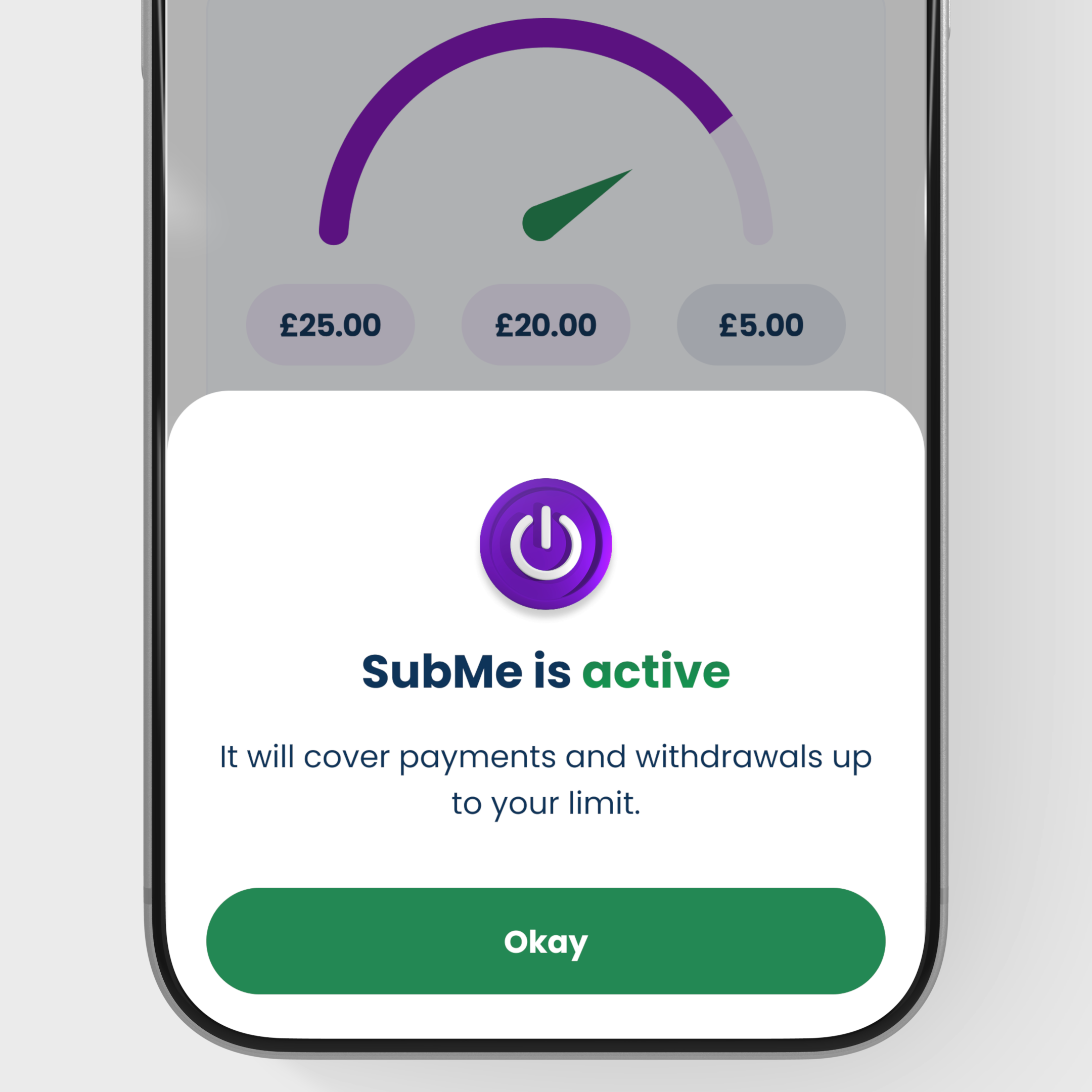
When the amount available changes, the experience communicates that without making the product feel unfamiliar.
The credit currently available became one of the clearest pieces of information in the experience.
Important borrowing information remained close to the decision rather than being hidden behind the final action.
The interface responds to eligibility and account position rather than forcing every customer through the same flow.
Changing limits reuse the same core patterns so customers do not have to relearn the product as it evolves.
Customers did not need the internal eligibility model, only a clear explanation of their current position.
Reusing core patterns across different limits makes the product easier to recognise and maintain.
The product prioritises a customer's current position and explains borrowing clearly before introducing another possible action.
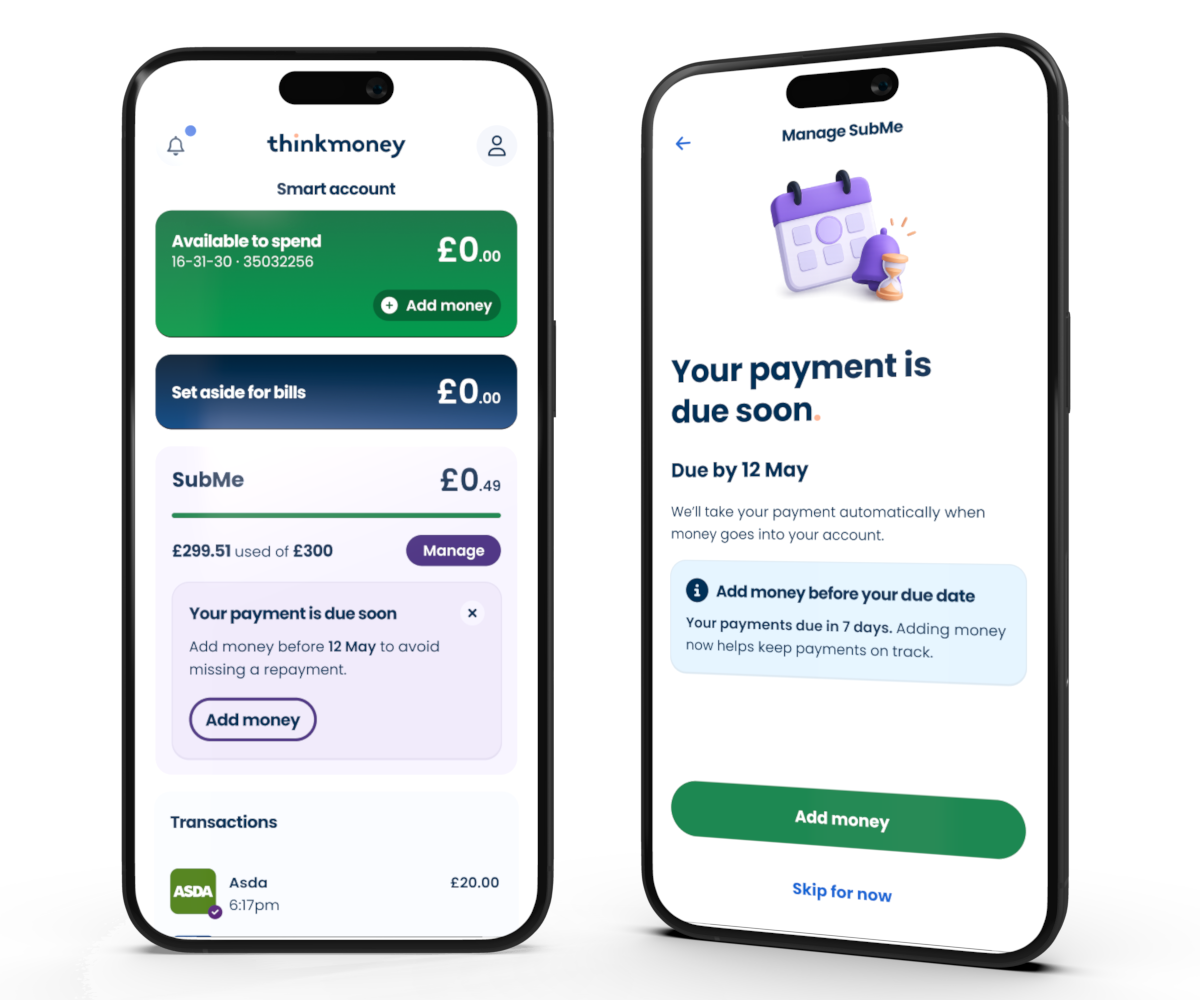
The interface prioritises the information customers need to understand first: whether SubMe is available, the amount they can access and their next action.
Supporting borrowing information remains visible and accessible around that decision without competing with the primary message.
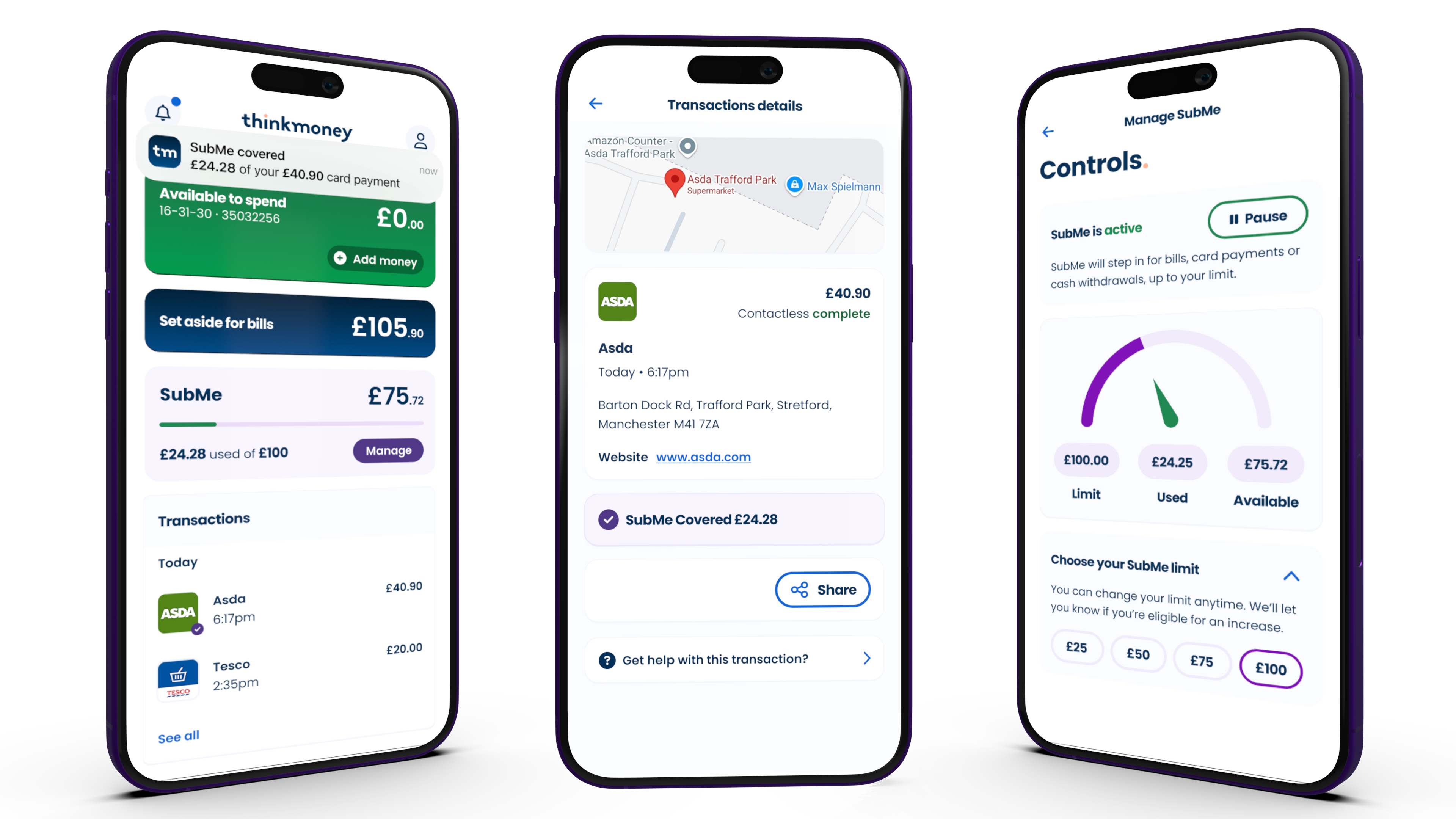
Translates eligibility, available limits and customer states into a clearer, more understandable experience.
Supports stepped limits from £25 through to £300 within one consistent product structure.
Positions the credit experience within the wider thinkmoney account rather than as a disconnected standalone journey.
Different available credit limits can be supported without creating separate product experiences.
Complex internal rules are translated into clearer customer states and understandable next steps.
Existing banking patterns connect SubMe to the wider account experience rather than making it feel bolted on.
The structure accommodates changing limits and customer states without requiring the journey to be rebuilt.
SubMe reinforced the importance of separating product complexity from customer complexity. Eligibility rules, customer states and changing limits can all exist behind the experience without requiring customers to understand every mechanism.
The design work concentrated on translating those rules into clear answers: whether the product is available, what the customer can access and what they need to understand before continuing.
It was another example of product design being as much about structuring information and decisions as designing individual screens.