Case study
Building order into a fragmented banking app.
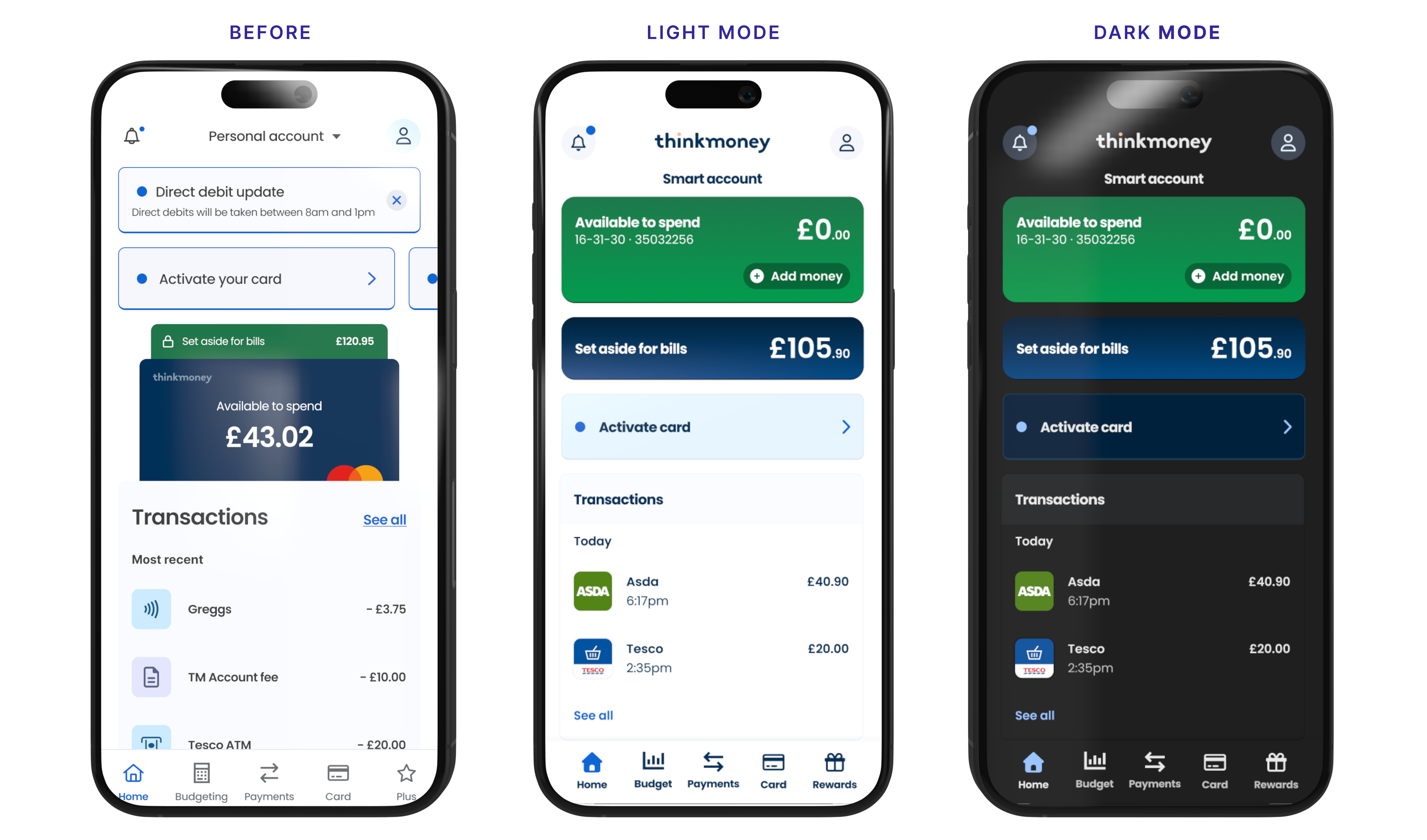
Following a major banking platform migration, I led the creation of a design system that brought consistency, accessibility and reusable patterns to the thinkmoney app.
Role
Lead Product Designer
Focus
Design systems, UX and accessibility
Contribution
Foundations, components and product patterns
Released
Iterative rollout
The migration was complete. The experience had paid the price.
thinkmoney had completed a major banking platform migration involving multiple engineering teams and external agencies. Delivery was the priority, but the customer experience became increasingly fragmented along the way.
Different parts of the app had been designed and implemented differently, leaving inconsistencies in spacing, typography, layout, interaction patterns and visual hierarchy.
Many styles and behaviours were also hard-coded, making simple changes expensive to deliver and difficult to apply consistently. What looked like a visual consistency problem was really a product-system problem.
Don't redesign the screens. Fix what the screens are made from.
Redesigning individual journeys would have improved them temporarily, but the same inconsistencies would continue appearing elsewhere.
I chose to work from the bottom up using an Atomic Design approach, establishing shared foundations before moving into reusable components, patterns and complete customer journeys.




One set of rules.
The first phase focused on decisions repeated throughout almost every screen: colour, typography, spacing, surfaces, grids, containers, iconography and responsive behaviour.
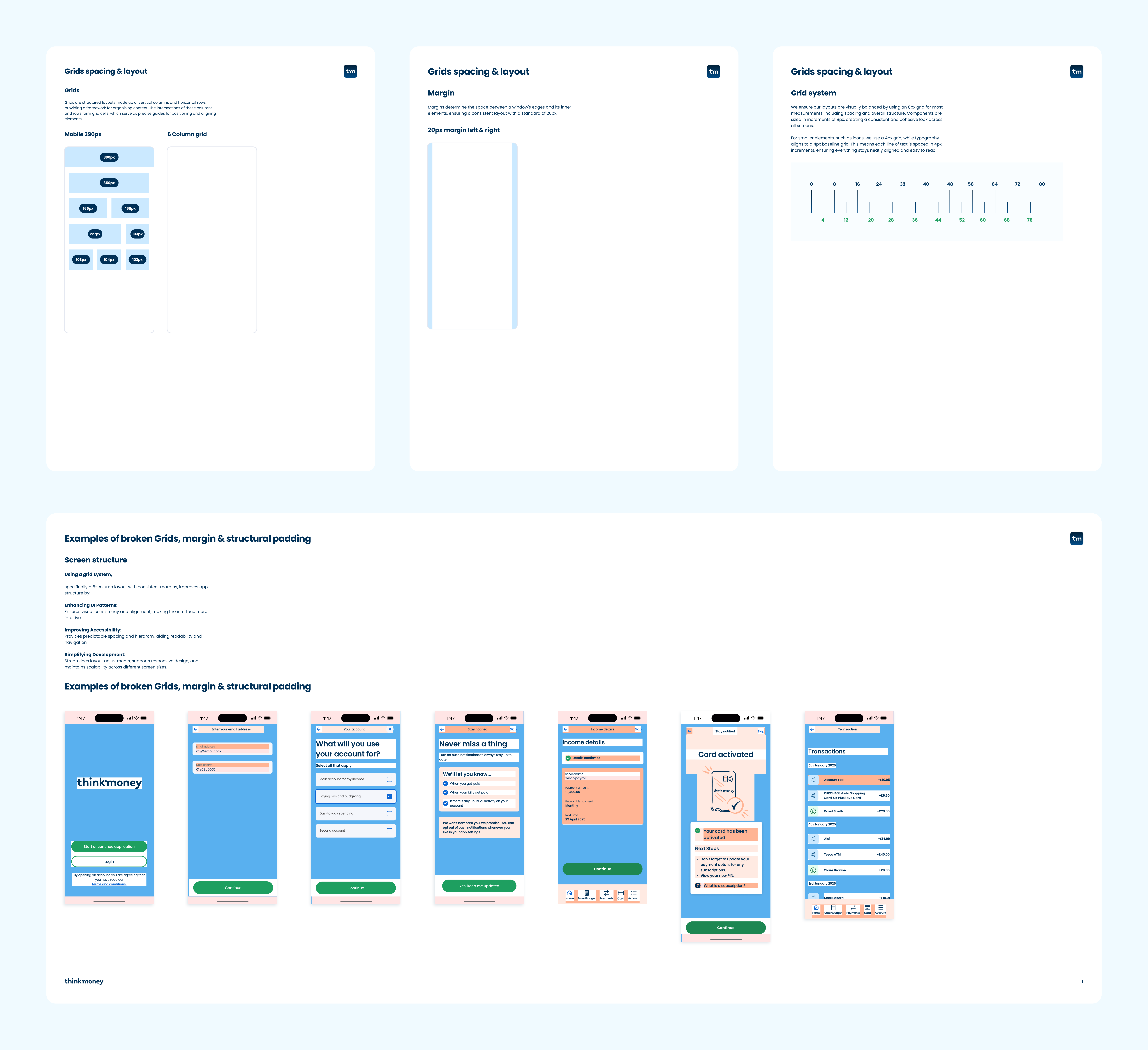
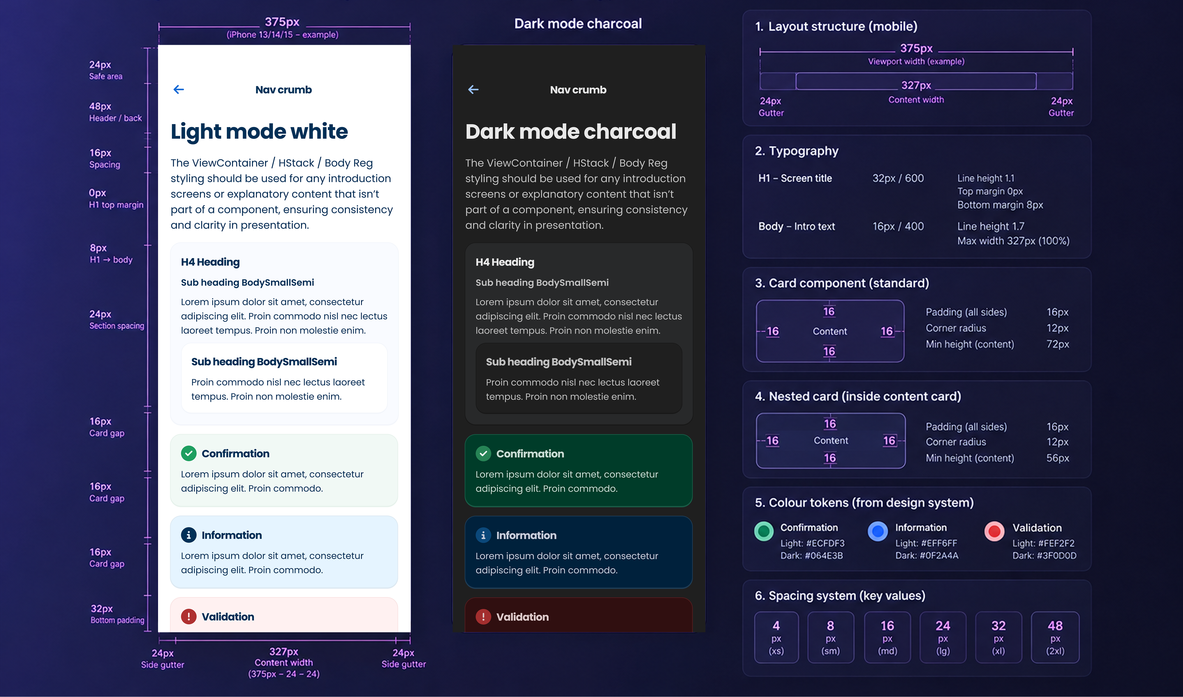
We established an 8px spacing system, 20px mobile margins and a six-column grid. Together these created a shared foundation for design and engineering and removed repeated decisions from future work.
As the system matured, components and implementation guidance were increasingly managed in Storybook, giving design and engineering a shared reference for the live product.
Giving the interface somewhere to live.
Content often appeared to float independently without a consistent relationship to the elements around it.
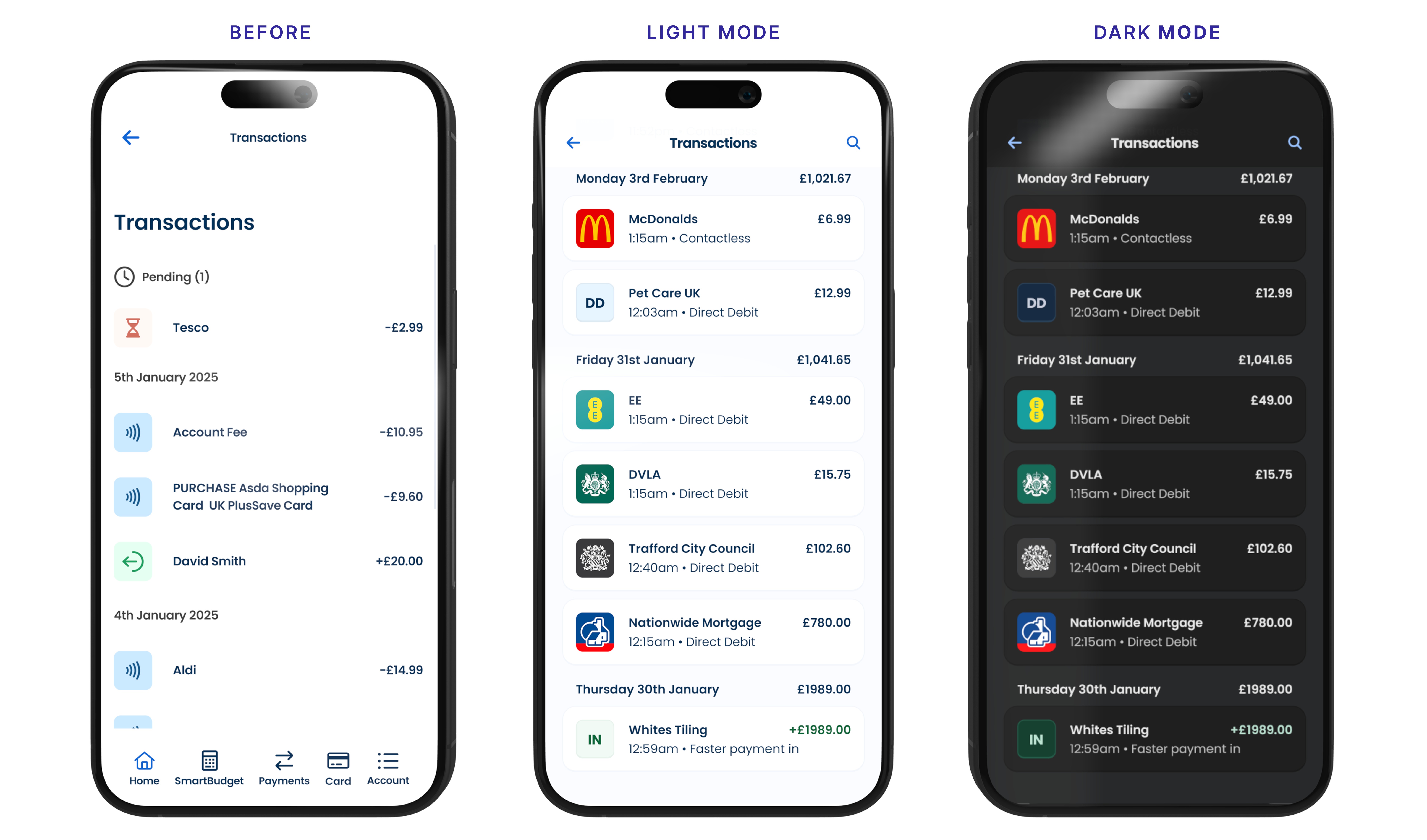
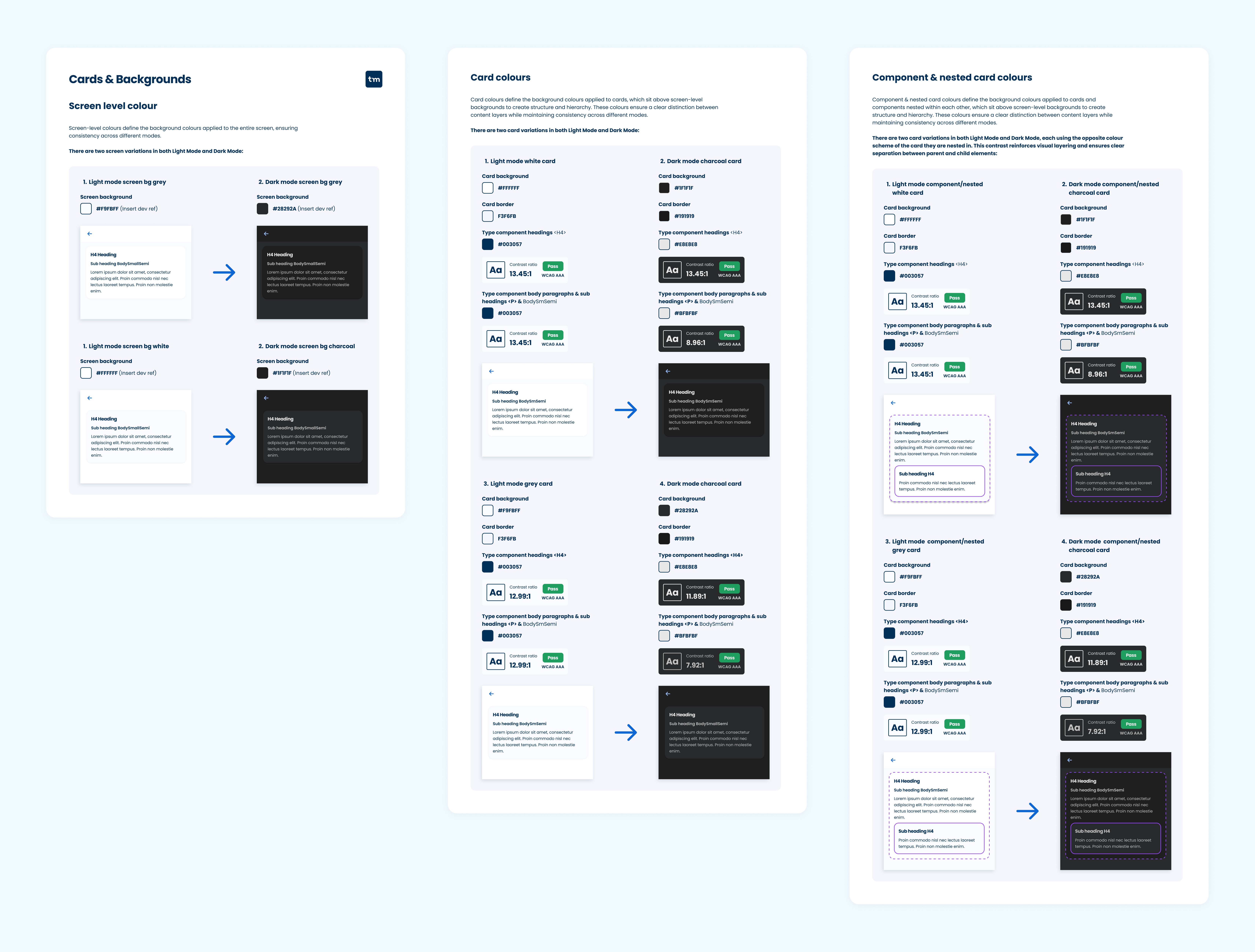
I introduced a simple opposing surface system, using contrasting cards against light and dark backgrounds. This gave information, actions and messaging predictable containers and helped previously disconnected areas feel part of the same product.
Turning spacing into a system rather than a judgement call.
Reusable spacing helpers replaced arbitrary values that had accumulated throughout the app. Screen margins were standardised and layouts rebuilt around predictable containers and grids.
Horizontal and vertical stack patterns controlled spacing and alignment, while wrapping behaviour allowed layouts to reflow as available space reduced.
Making alignment predictable.
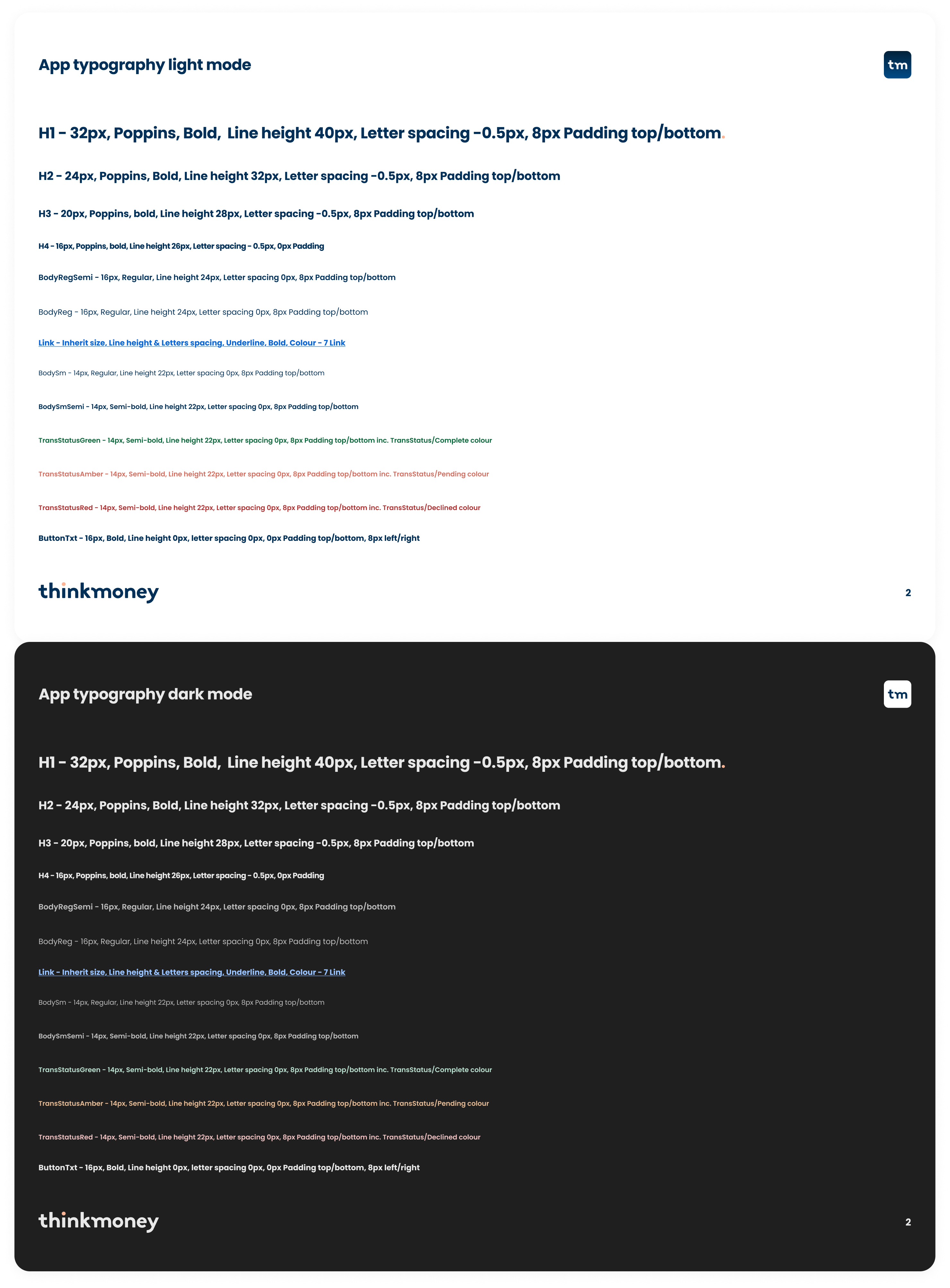
Typography was rebuilt as a defined hierarchy rather than a collection of individual styles. Heading levels, supporting text and spacing relationships were documented and aligned to the wider layout system.
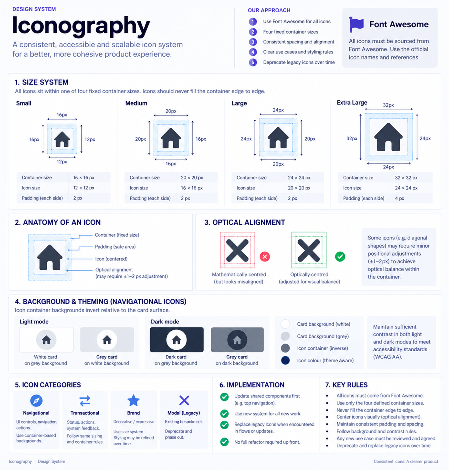
The same thinking was applied to iconography. Predictable sizes and containers kept icons aligned consistently with typography across transactions, lists and horizontal layouts.
If the system didn't scale, the product didn't scale.
Accessibility problems already existed across colour contrast, text scaling and screen-reader behaviour, so I treated accessibility as part of the foundations rather than something to check after components had been designed.
Colour combinations were reviewed and corrected where contrast was insufficient. We also tested journeys with accessibility tooling to identify controls whose labels didn't provide enough information when read independently from the surrounding interface.
Generic actions were replaced with more descriptive labels where context was required, helping screen-reader users understand what an action would do or where it would take them.
We also designed for increased operating-system text and display settings. Layouts could reflow as content became larger, while non-essential decorative elements could be removed where necessary to preserve space for important information and actions.
Build once. Use with confidence.
Once the foundations were established, repeated solutions could move into a shared component library.
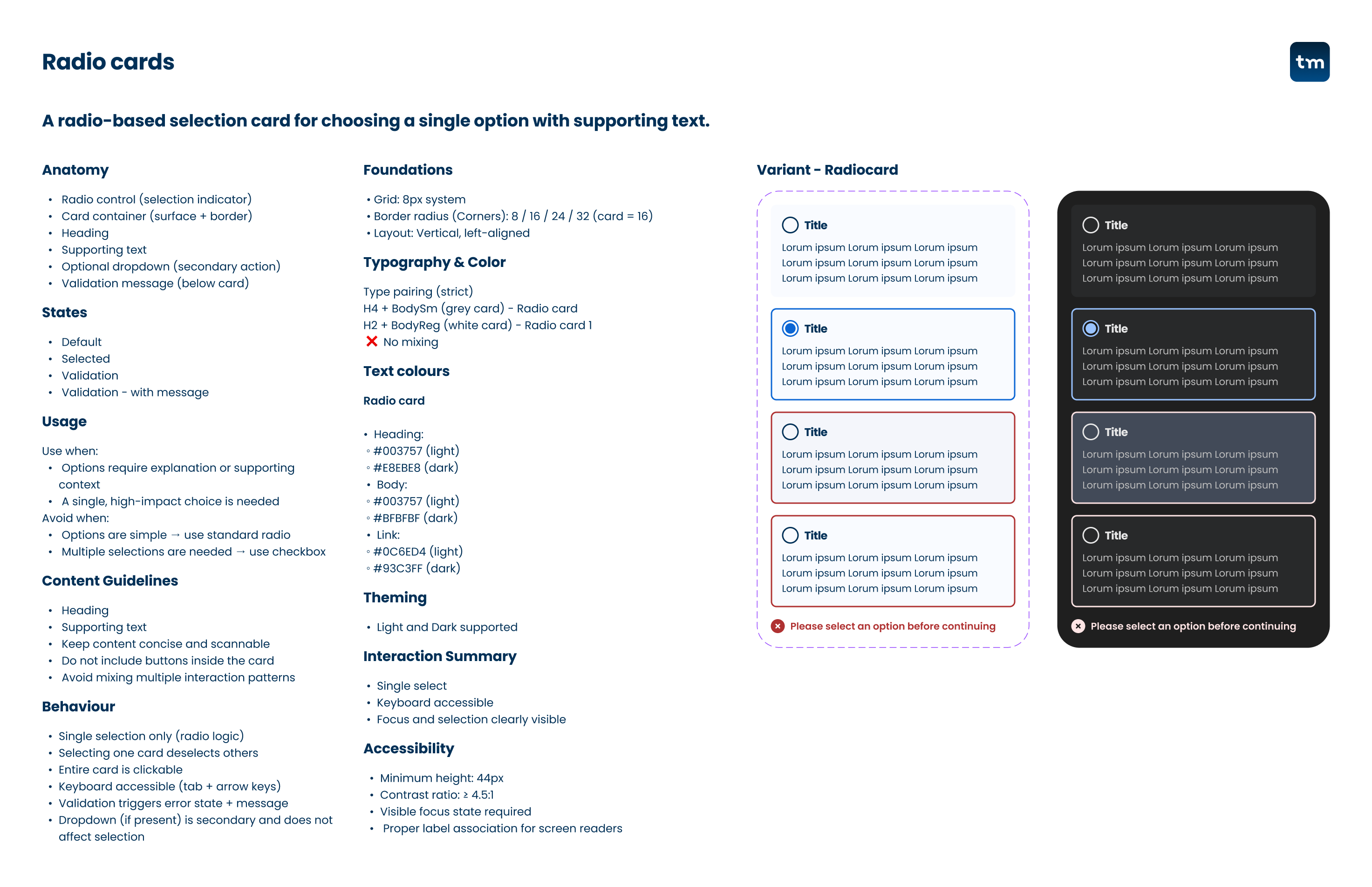
Buttons were standardised around primary, secondary and tertiary actions with clear rules for their use. The library expanded into toggles, radio buttons, selection pills, date pickers, validation, tooltips, lists, keypads and progress indicators.
Components captured more than appearance. Layout, spacing, hierarchy, states and accessibility behaviour could now be reused rather than interpreted independently each time.
The system was still evolving when I left. Some areas, including forms, had adopted the new foundations and layout rules without yet being completely componentised.
A component isn't the UX.
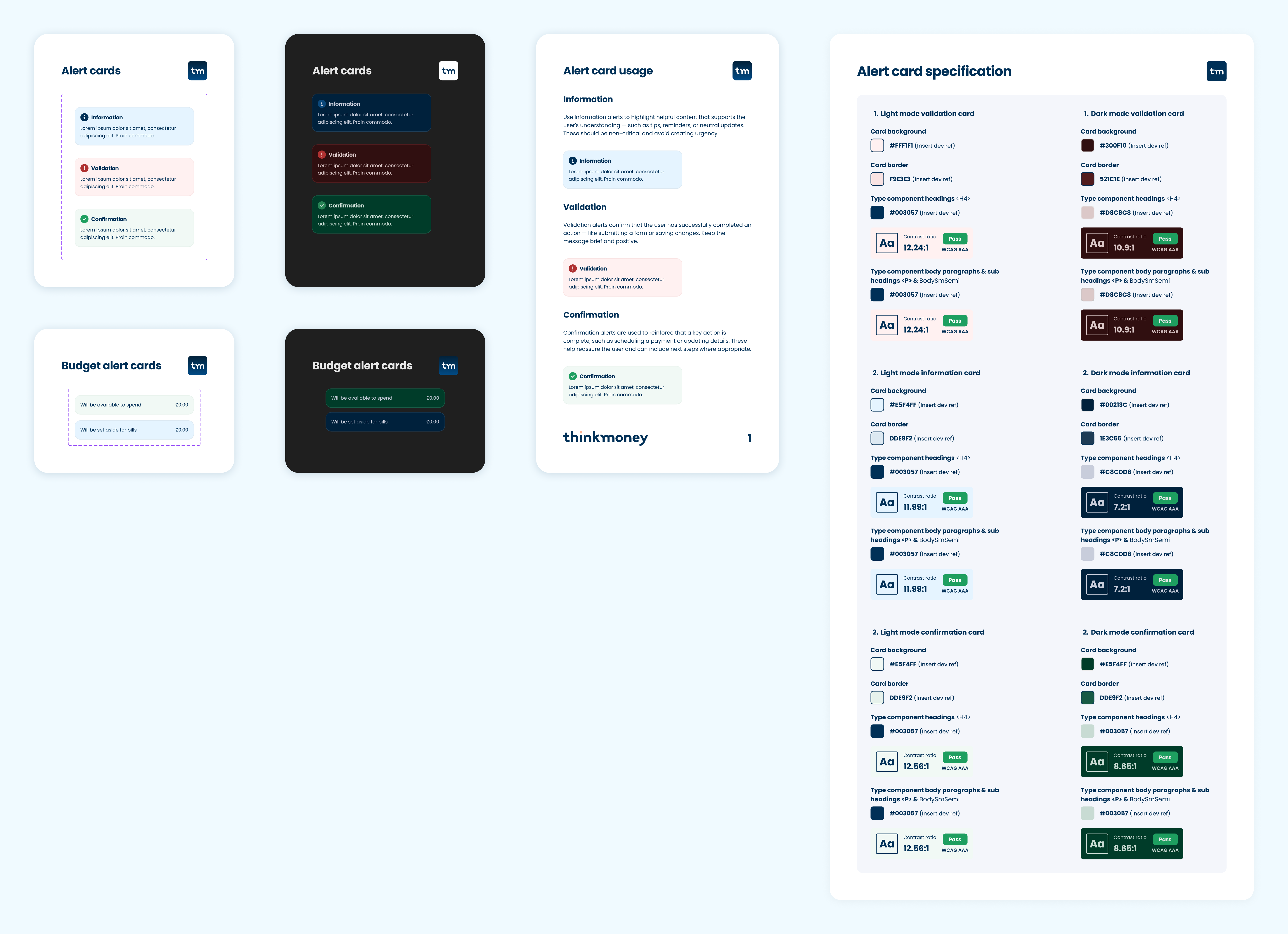
Messaging had become another source of inconsistency, particularly around information, validation and confirmation.
We created reusable alert cards with clear semantic variants that could be used consistently for account information, regulatory requirements and actions needing customer attention.
More importantly, the UX principle was to help customers avoid an error wherever possible rather than waiting for them to make one and correcting them afterwards.
From consistent screens to consistent behaviour.

As the system matured, we could address inconsistency across complete customer journeys rather than individual screens.
We established a predictable structure around important financial actions such as creating a payee or making a Faster Payment.




The same structure could be reused across payments, standing orders and other important actions, creating consistency at the experience level rather than simply making individual screens look alike.
One system. Three propositions.
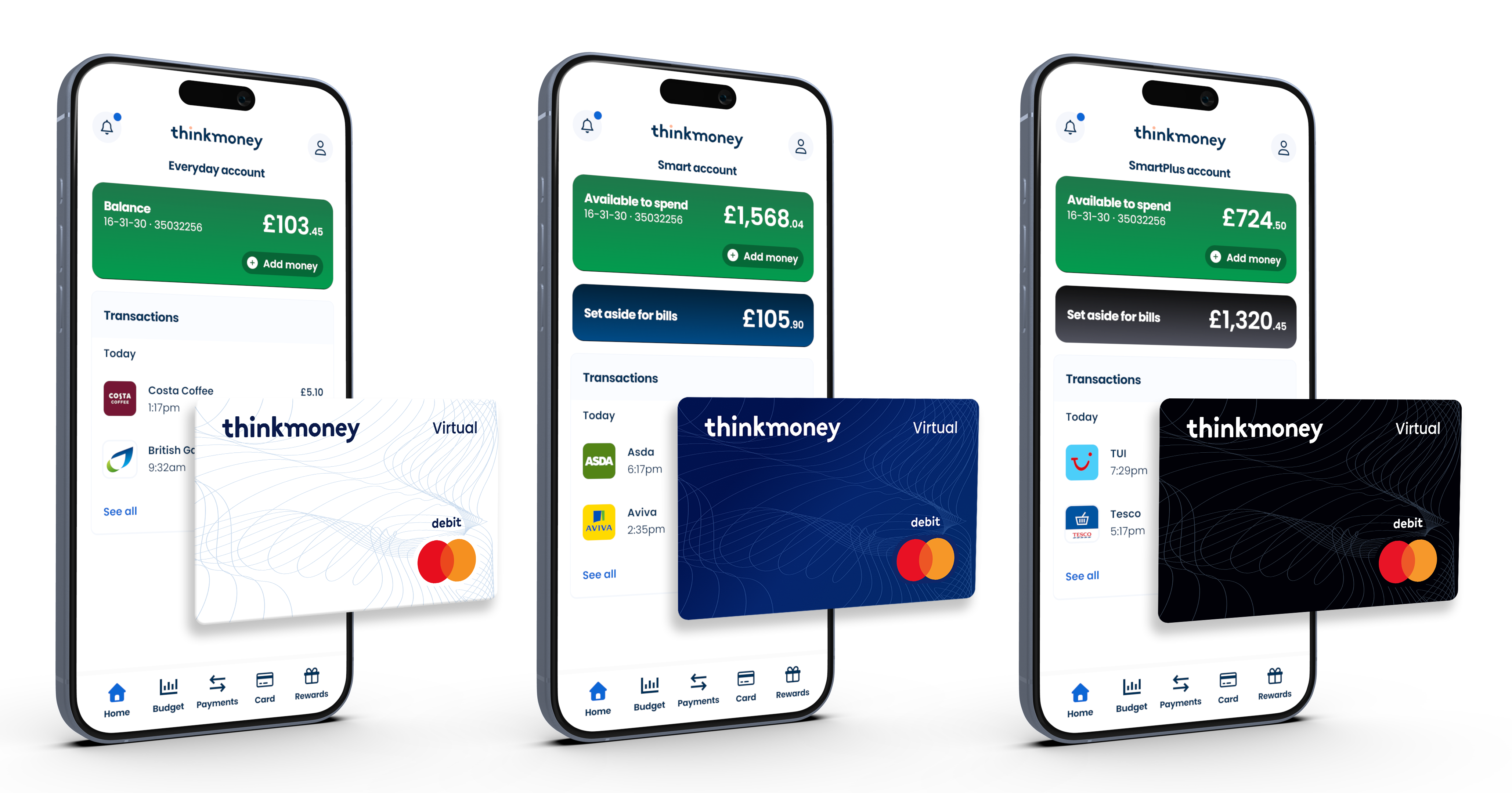
thinkmoney offered three account levels: Everyday, Smart and Smart Plus, but the distinction between them wasn't always clear enough.
The system gave each account a more recognisable identity while keeping the underlying product experience familiar and consistent.
Everyday · Core account / Smart · Enhanced proposition / Smart Plus · Premium proposition
The foundations made the next problem easier.
Once the foundations and common patterns were established, individual journeys could be revisited with far fewer basic decisions still to make.
Payment journeys, standing orders, budgeting, account management and home-screen messaging could now build on an established visual and behavioural language.
That didn't replace UX work. It gave us a stronger starting point for it.
Less reinvention. More confidence.
Common layouts, components and behaviours began replacing the one-off solutions that had accumulated during the platform migration, creating a more coherent product.
Accessibility became part of the same system, with improvements to contrast, text scaling and assistive-technology behaviour built into the foundations and reusable patterns.
For engineering, reusable components and established patterns reduced interpretation on new work. Engineers described later projects as significantly quicker to deliver, with some estimating roughly a third less effort than comparable work before the system was established.
The biggest change wasn't visual.
The design system gave design and engineering a common language, but its real value was reducing the number of problems teams had to solve repeatedly.
It reinforced something I've carried into later product work: consistency isn't about making every screen look the same. It's about solving recurring problems once, then giving teams enough structure to concentrate on the problems that are genuinely new.